
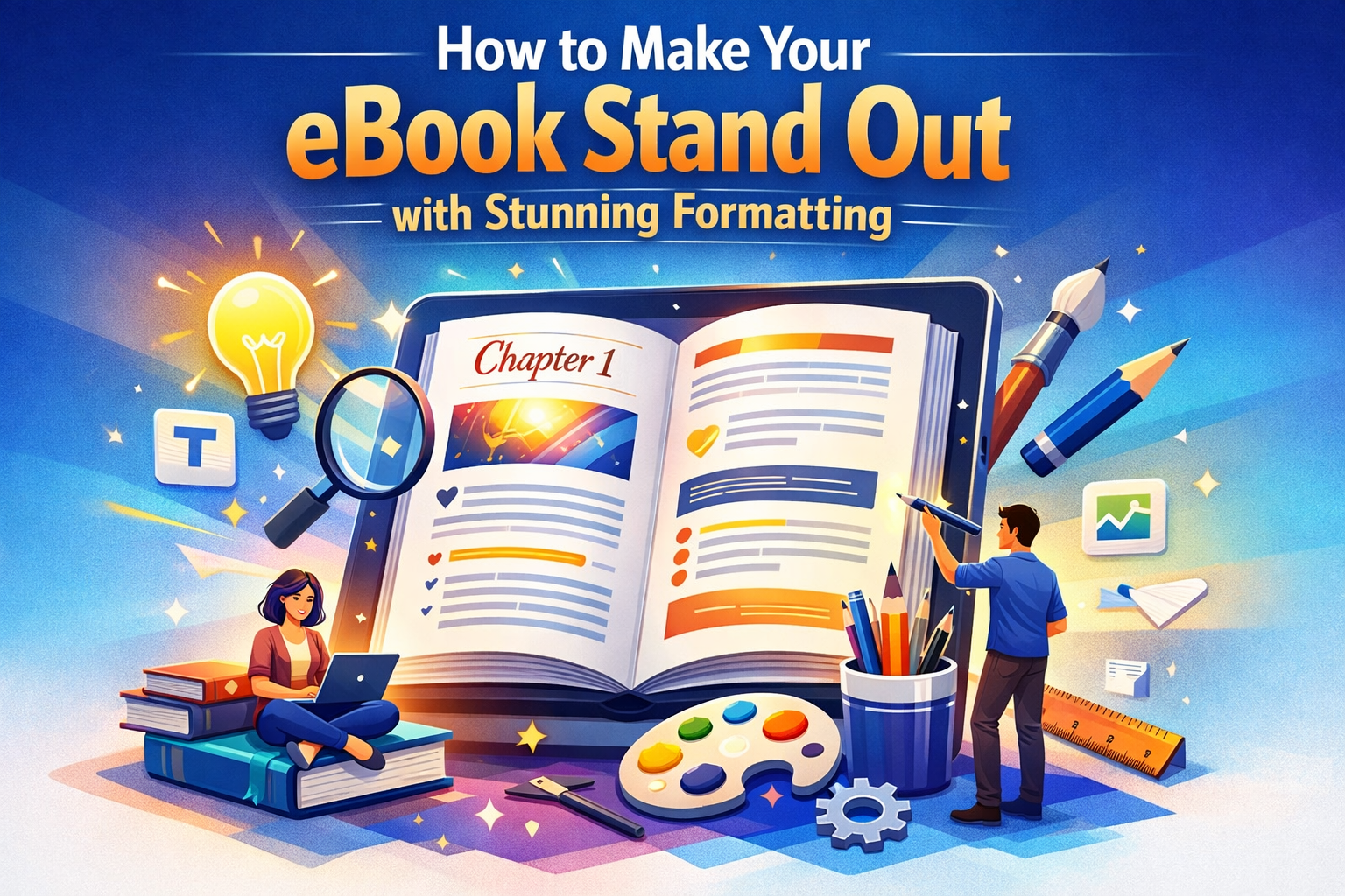
In the crowded world of self-publishing, making your eBook stand out is a challenge that every author faces. While the content of your book is crucial, the presentation also plays a key role in attracting readers. Stunning eBook formatting can be the difference between a book that gets lost in the shuffle and one that grabs a reader’s attention and keeps them hooked. A well-formatted eBook is not only more professional but also enhances the reading experience, making it easier and more enjoyable for your audience.
In this blog, we’ll dive into how to make your eBook stand out with stunning formatting that makes it stand out in the digital marketplace. We’ll cover essential formatting tips, design elements, and best practices that will give your eBook a professional edge.
1. Why eBook Formatting Matters
eBook formatting is essential because it ensures that your book looks great across a variety of devices, from Kindles and Nooks to smartphones and tablets. When done right, it makes your book more visually appealing, easier to read, and more enjoyable for the user. Proper formatting also conveys professionalism, which increases your chances of garnering positive reviews and gaining loyal readers.
- Poor formatting can lead to frustrated readers who might abandon your book halfway through.
- Professional formatting ensures a smooth reading experience, enhancing the reader’s journey.
2. Focus on Readability and Text Layout
The most important aspect of stunning eBook formatting is readability. If your book’s text is hard to read, no amount of design will save it. Make sure to prioritize these key elements:
a. Font Choice
- Pick readable fonts: Fonts like Georgia, Arial, and Times New Roman are widely accepted and easy on the eyes. Choose serif fonts for body text and sans-serif for headings.
- Avoid fancy fonts: While decorative fonts may seem appealing, they can be hard to read, especially on smaller devices.
b. Font Size and Line Spacing
- Font size: Keep the text at a comfortable reading size (usually between 10-12 pt). Make sure the text size adjusts well on different devices.
- Line spacing: Use 1.5x line spacing to avoid cramped text and ensure readability, especially on smaller screens.
c. Paragraph and Margin Setup
- Consistent margins help maintain a clean look. Avoid having wide margins or large gaps between paragraphs.
- Indent paragraphs slightly to give the text a professional, book-like feel, but don’t overdo it. Excessive indentation can make the eBook look awkward.
d. Text Alignment
- Left-align the text: In eBook formatting, left-aligned text is much easier to read than justified text. Justified text can create awkward gaps between words and disrupt the flow of the content.
3. Use Images and Graphics Effectively
Visuals can greatly enhance the appeal of your eBook, but they need to be used wisely. Too many images or poorly placed graphics can distract readers from the content. Here’s how to use them effectively:
a. Book Covers
- The cover is the first impression of your eBook. Make sure it’s high quality and eye-catching. A professional, visually appealing cover is key to attracting potential readers.
b. Internal Images
- Use images sparingly and ensure they’re relevant to the text. For example, if you’re writing a cookbook, include relevant recipes, images of finished dishes, or step-by-step photos.
- Make sure the images are properly sized and optimized for digital reading. Avoid using too large or too small images that might not scale well on all devices.
- Ensure your images don’t slow down the download time. This is especially crucial for readers using devices with lower processing speeds or data restrictions.
c. Graphics and Charts
- Infographics, graphs, and charts are perfect for non-fiction books that include statistics, comparisons, or any data-driven content.
- Ensure legibility: Graphics should be clear and easy to understand even on smaller screens. Use high-resolution files but compress them to avoid slowing down the file size.
4. Optimize Your Table of Contents (TOC)
A Table of Contents (TOC) is an essential element for eBook navigation. It helps readers easily find chapters or sections within the book, improving their overall experience.
a. Make it Clickable
- Ensure that your TOC is interactive, meaning readers can click on a chapter title to jump directly to it. This is especially useful for non-fiction books with multiple sections.
- This feature improves the user experience, especially for eBook readers, who appreciate being able to navigate without constantly scrolling.
b. Organize Properly
- Keep your TOC neat and organized. Use clear headings for each section or chapter. Make sure each chapter title is easy to identify, so readers can quickly locate the content they’re interested in.
5. Consistent Style for Headings and Subheadings
Headings and subheadings help break up the content and make the eBook easier to navigate. Formatting them properly is key to a professional look.
a. Use Heading Styles
- Use consistent heading styles for titles, subtitles, and chapter headings. Typically, Heading 1 is used for chapter titles, while Heading 2 and Heading 3 are used for subheadings and smaller sections.
- This ensures that the eBook looks organized, and helps with navigation and searchability.
b. Font Size for Headings
- Headings should be noticeably larger than the body text to create a clear visual hierarchy. For example, Heading 1 might be 16-18 pt, while body text should be 10-12 pt.
6. Test and Optimize for Multiple Devices
Unlike print books, eBooks must be viewable across multiple devices, from smartphones and tablets to e-readers like Kindles and Nooks. It’s crucial to ensure that your eBook formatting looks consistent and professional across various devices.
a. Test Your eBook
- Test your eBook formatting on multiple devices to ensure that everything displays correctly. Most eBook retailers (like Amazon Kindle, Apple Books, and Barnes & Noble) allow you to preview your eBook on various devices before publishing.
- Pay attention to how images, text, and links are displayed on different screen sizes.
b. Adjust for Screen Sizes
- For smartphones, make sure the text is large enough to read without zooming in. For larger devices like tablets, ensure that the images are proportionally scaled and the text looks well-structured.
7. Hire a Professional eBook Formatter
While DIY formatting tools like Scrivener and Calibre are available, hiring a professional eBook formatter ensures that your eBook meets industry standards and looks its best. A professional will help with:
- Device compatibility across multiple platforms.
- Proper image compression without sacrificing quality.
- Creating an interactive Table of Contents (TOC) and ensuring links work properly.
- Optimizing file sizes to ensure fast downloads.
Professional formatting is a worthy investment for authors looking to make their eBook look polished and professionally presented.
8. Conclusion: Stand Out with Stunning Formatting
Your eBook formatting is crucial to its success. Proper formatting ensures that your book is readable, professional, and optimized for digital devices. By focusing on layout, fonts, images, and navigation, you can create a book that is easy to read and visually appealing.
At Book Planets, we specialize in eBook formatting services that will help you create a stunning eBook that stands out in the digital marketplace. Whether you’re self-publishing or submitting to a traditional publisher, we’re here to help.
FAQs
- How much does eBook formatting cost?
- The cost of eBook formatting varies depending on the complexity and length of your manuscript. It typically ranges from $50 to $300 for professional formatting services.
- Can I format my eBook myself?
- Yes, you can use tools like Calibre, Scrivener, and Kindle Create to format your eBook. However, professional formatting ensures a polished and error-free product.
- What is the best format for eBooks?
- The most common eBook formats are EPUB (for most platforms) and MOBI (for Amazon Kindle). A professional formatter will ensure your eBook is formatted for all major platforms.
- Do I need to format my eBook for different devices?
- Yes, it’s important to ensure that your eBook displays correctly on different devices (smartphones, e-readers, tablets). Proper formatting ensures that the layout adjusts based on screen size.
- What’s the difference between eBook formatting and print formatting?
- Print formatting is fixed—the layout remains the same on every page. eBook formatting is fluid, allowing the text to adjust based on the reader’s preferences and screen size.